
Creative Design: Going the Extra Mile…
In the latest blog as part of our design series, Tom Walker, Design Manager at Napier, shares ways he goes the extra mile to provide our clients with engaging, and creative design.
Going the extra mile. No, I’m not referring to adding an extra 1,760 yards to your next marathon run, although I’d be hugely impressed if you did, what I mean is keeping your client happy by going that bit further and really trying to bring their campaign to life. As designers it is our role to interpret a brief and come up with a solution that combines words and images in an imaginative, informative and visually effective way. The whole reason a client would ever come to an agency is to seek their expertise, you would never go to an estate agent if you didn’t think they could sell your house, would you?
Human beings are visual creatures, we appreciate the way things look, our homes have beautiful furniture, colour co-ordinated interiors and manicured gardens. It creates a feeling of well-being, of inner contentment when we are surrounded by beautiful things. None of this is rocket science really, the same is true of design, if we can use a bit of imagination, creativity and visual flair in a campaign, then it will have much more impact. Designs need to look good, be clear and communicate the message effectively.
For example, let’s say you were producing a web banner to promote a new solar panel. You have an image, a line of text, a logo, then all you need to do is size it to the dimensions and job done! All well and good, yes you could just make do with what you have, but why not make it an animated banner? You could then include far more information, the product on one frame, the benefits on another and a call to action on the final one perhaps? Or maybe show different products on different frames, with a call to action at the end. All of these make the user experience much more dynamic and interactive, and you have also found a way to highlight several different features.
Brochures are another tactic that offers an opportunity to go the extra mile. When we are asked to design a brochure, we often suggest the option of an online version as well.
In addition to a printed document, we are able to adapt design so it works as a PDF file with navigation. They can feature forward and backward buttons, chapter headings at the top or side of the page which are navigation tools. “Click here to find out more” buttons could be introduced as well as call-out boxes where more detailed information can be highlighted. We could even embed video links. Although it’s great to suggest these things, we understand that budgets can be restrained, but find this kind of input and expertise is appreciated, even if our clients decide not to go ahead with the extra work.
In a recent survey it was shown social media posts with moving images were 6 times more effective in generating a response than static ones. There is still a place for static posts, but for a better return on investment, then an animation or video can be a much more effective alternative. We work closely with our clients to understand their needs, and how we can generate ads like this to improve engagement.
Good design will attract, inspire and motivate people to respond to our messages and ultimately drive sales. Design is an ever-changing process, we always need to be pushing the boundaries. New software is constantly being released which enables us to do more exciting things. The Adobe Creative Cloud has an ever-growing list of specialist programs for animation, video, and web. At Napier we are looking at the latest software and seeing how we can use it to help our clients, as the Napier approach is all about going the extra mile!
Interested in how we can help your designs go the extra mile? Why not get in touch, we’d love to hear from you.

What Makes a Successful Infographic?
In the first blog of our Design series, Tom Walker, Design Manager at Napier, shares his views on what makes an infographic successful.
I have been a graphic designer for more years than I care to remember, well to be precise it was way back in 1987 I graduated from Croydon College with my impressive Higher National Diploma in graphic design, or at least so I thought at the time! Coventry City had just won the FA Cup, Rick Astley was riding high in the charts with “Never Gonna Give You Up”. Mobile phones were the size of bricks, and the charger that came with them might just about fit inside your briefcase if you were lucky! The world was a different place. Then along came the internet and everything changed…
The same is true with design, the way we share information is completely different. We are living in an increasingly visual society. Few will sit down and read a newspaper from cover to cover, much more likely to read a few paragraphs of text on a website and analyse an interesting graphic or photograph! What is the saying, a picture tells a thousand words? Definitely true.
The internet has enabled us to share information with anybody, anywhere in the world at any time. New technology has allowed us to get the message across far more quickly than ever before. Graphic design is probably more important now than it’s ever been before to make our work stand out from the crowd! All of which leads me to the chosen topic of this particular blog… what makes a successful infographic?
Understanding the brief
I would define a successful infographic as one that tells a story in a clear, concise and visual way. In order to do this, we as designers must fully understand the process we are trying to visualise. To be precise we need to ask the client exactly what it is they are trying to communicate, so we are totally clear on what the narrative should be. Once we understand, we then need to be able to interpret the information and present it in an engaging, creative and informative way. There has to be a logical flow to the information. Above all else, it needs to be simple! Too much information and it becomes confusing and cumbersome, the reader will find it too hard to understand and will rapidly lose interest.
What works well?
We also need to be aware of corporate guidelines if we are designing an infographic for a client which needs to be on-brand. Colours, fonts and logos may well be pre-determined, but we shouldn’t be afraid to push the boundaries and try things that are a bit more exciting, the client will appreciate any extra creative input. The main thing is that the design concept is clear and logical. Text should be short and snappy, and long paragraphs are a definite turn off and so should be avoided.
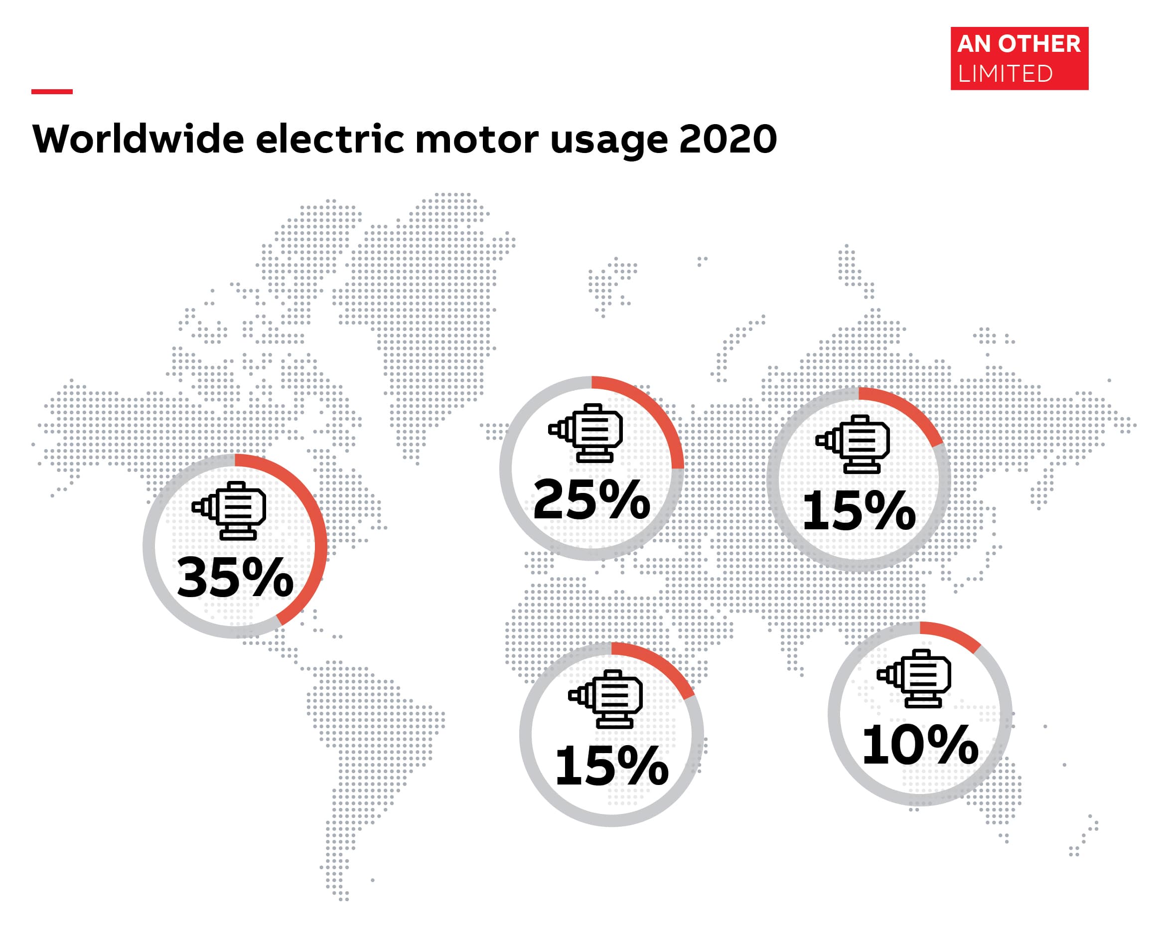
So, for example, if we were creating an infographic that shows the number of electric motors used in different parts of the world, an icon of a motor could be used on top of a map of the work. The percentage figure could appear as a bold number, with a stylised circle that represented the proportion. Text is kept absolutely to a minimum.
Where the infographic is used will also determine the look. If it is going to be used in print, then it may appear on an A4 portrait page in a brochure, but if it is going to be used online, then maybe a more landscape screen format might work better. It all comes back to the point I was making earlier, it is imperative to fully understand where and how the infographic is going to be used, so it can be designed accordingly.
If it is for the web, then interactive features can be introduced. In the example above each circle could become a button, so if you clicked on Europe, this could link to another call-out box with more information. Alternatively, videos could be embedded which could play when clicked. The creative possibilities are endless.
To summarise
In 3 words: Understand, Interpret, Simplify, although I guess that could just be the title for a new Rick Astley song!
Interested in how we can help you develop a successful infographic? Why not get in touch, we'd love to hear from you.